Demo
El proyecto esta disponible en https://arturomauriciodev.github.io/socialMedia/.
Tabla de Contenidos
Descripción
Este proyecto realizará la maquetación del siguiente reto en HTML, CSS y JavaScript considerando los siguientes requerimientos:
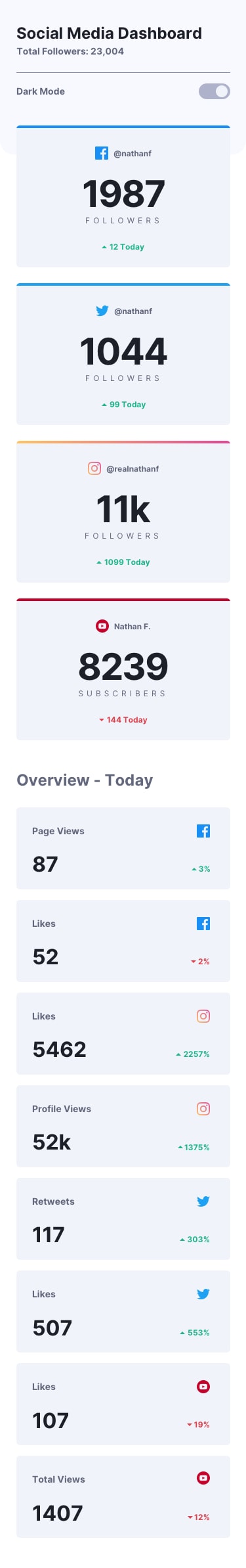
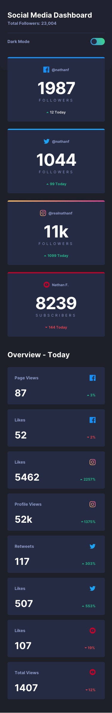
Para mobile
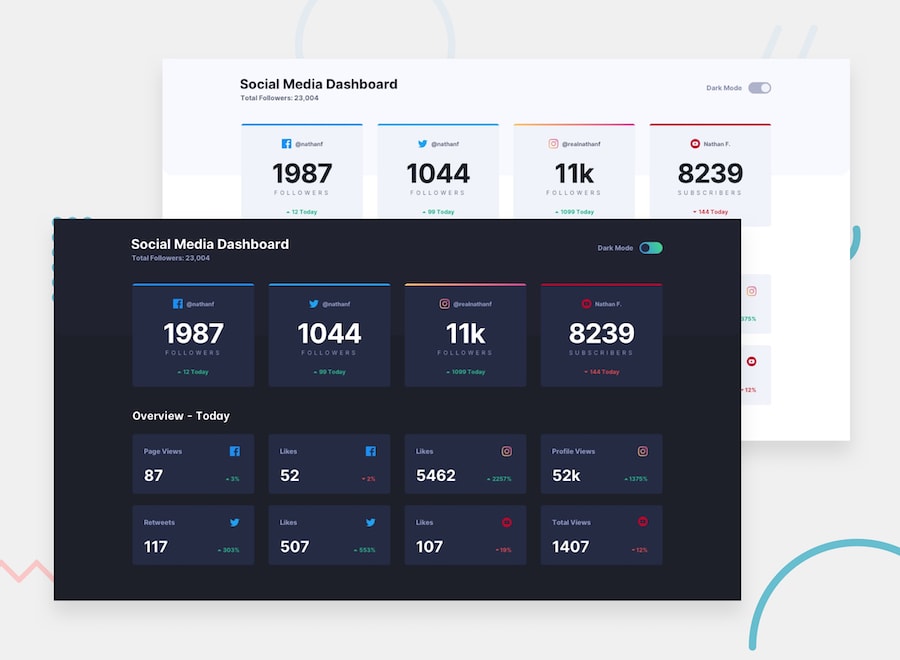
Para desktop
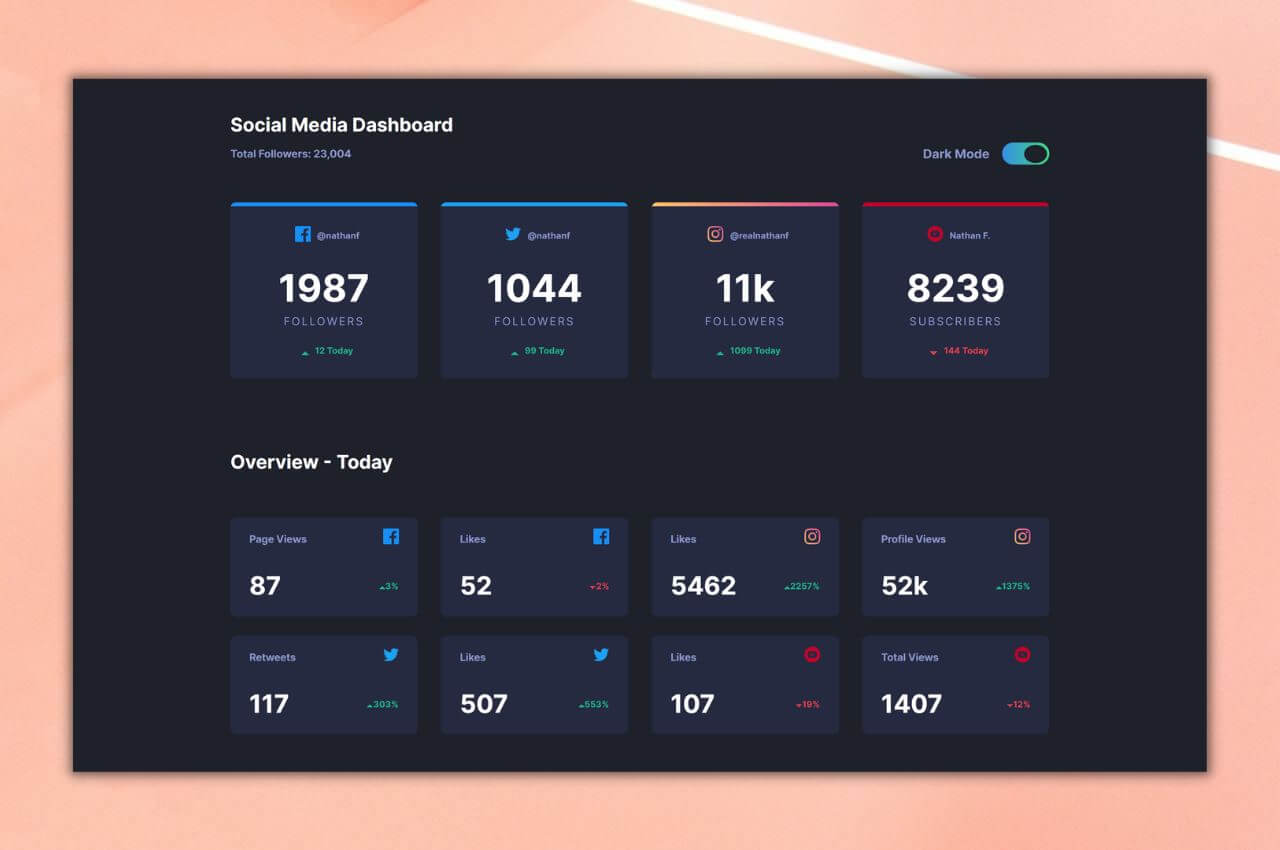
El reto
El reto consiste en construir esta página inicial y que se parezca lo más posible al diseño.
Los usuarios deberían poder:
- Ver el diseño óptimo para el sitio según el tamaño de pantalla de su dispositivo (Mobile First es requerido)
- Ver el efecto hover para todos los elementos interactivos de la página
- Cambiar el tema de color de su preferencia
También se utilizó el archivo de style-guide.md, que contiene la información necesaria, de la paleta de colores y fuentes.
Créditos por el diseño y reto
Este reto pertenece a la lista de retos de Frontend Mentor. Para más información puede visitar este enlace.
Construcción del proyecto
Se construyó utilizando la metodología mobile first para dispositivos de 375px, 1024px y 1440px. Asimismo, para los estilos se hace el uso de la metodología BEM. También se utiliza JavaScript Vanilla para la manipulación del DOM haciendo funcional el theme switcher para cambiar el color del tema de acuerdo con su preferencia.
A continuación se mostrará algunos detalles y buenas prácticas:
Estructura HTML
Carga independiente de las hojas de estilos.
 <link rel="stylesheet" href="./styles/styles.css">
 <link rel="stylesheet" href="./styles/desktop1024.css" media="screen and (min-width: 1024px)">
 <link rel="stylesheet" href="./styles/desktop1440.css" media="screen and (min-width: 1440px)">
Utilización adecuada de etiquetas para mejorar la accesibilidad.
<article>
            <h2 class="header__h2 light">
                Social Media Dashboard
            </h2>
            <article class="header__article">
                <small class="header__small light">
                Total Followers: 23,004
                </small>
                <div class="header__div light">
                    <p>
                        Dark Mode
                    </p>
                    <label class="switch">
                  <input id="switch" type="checkbox">
                  <span class="slider light round"></span>
                </label>
                </div>
            </article>
        </article>
Estilos en CSS
Uso de variables
:root {
    font-family: 'Inter', sans-serif;
    --scroll-gap: 1.5rem;
    /* Primary */
    --LimeGreen: hsl(163, 72%, 41%);
    --BrightRed: hsl(356, 69%, 56%);
    --Facebook: hsl(208, 92%, 53%);
    --Twitter: hsl(203, 89%, 53%);
    --Instagram: linear-gradient(to right, hsl(37, 97%, 70%), hsl(329, 70%, 58%));
    --YouTube: hsl(348, 97%, 39%);
    /* #### Light Theme */
    --White-BG: hsl(0, 0%, 100%);
    --VeryPaleBlue-TopBGPattern: hsl(225, 100%, 98%);
    --LightGrayishBlue-CardBG: hsl(227, 47%, 96%);
    --DarkGrayishBlue-Text: hsl(228, 12%, 44%);
    --VeryDarkBlue-Text: hsl(230, 17%, 14%);
    /* #### Light Theme */
    --Toggle: hsl(230, 22%, 74%);
    /* #### Dark Theme */
    --VeryDarkBlue-BG: hsl(230, 17%, 14%);
    --VeryDarkBlue-Top-BG-Pattern: hsl(232, 19%, 15%);
    --DarkDesaturatedBlue-CardBG: hsl(228, 28%, 20%);
    --DesaturatedBlue-Text: hsl(228, 34%, 66%);
    --White-Text: hsl(0, 0%, 100%);
    /* #### Dark Theme */
    --Toggle-dark: linear-gradient(to right, hsl(210, 78%, 56%), hsl(146, 68%, 55%));
}
Construcción del slider
/* The switch - the box around the slider */

.switch {
    position: relative;
    display: inline-block;
    width: 60px;
    height: 28px;
}


/* Hide default HTML checkbox */

.switch input {
    opacity: 0;
    width: 0;
    height: 0;
}


/* The slider */

.slider {
    position: absolute;
    cursor: pointer;
    top: 0;
    left: 0;
    right: 0;
    bottom: 0;
    background-color: var(--Toggle);
    -webkit-transition: .4s;
    transition: .4s;
}

.slider.round.dark {
    background-image: var(--Toggle-dark);
}

.slider:before {
    position: absolute;
    content: "";
    height: 23px;
    width: 29px;
    left: 2px;
    bottom: 2px;
    background-color: white;
    -webkit-transition: .4s;
    transition: .4s;
}

.slider.dark:before {
    background-color: var(--VeryDarkBlue-BG);
}

input:checked+.slider {
    background-color: #2196F3;
}

input:focus+.slider {
    box-shadow: 0 0 1px #2196F3;
}

input:checked+.slider:before {
    -webkit-transform: translateX(26px);
    -ms-transform: translateX(26px);
    transform: translateX(26px);
}


/* Rounded sliders */

.slider.round {
    border-radius: 34px;
}

.slider.round:before {
    border-radius: 50%;
}

.parent {
    padding: var(--scroll-gap);
    /* height: 40vh; */
    overflow: auto;
    scroll-snap-type: mandatory;
}

.child {
    /* height: calc(50vh - 3 * var(--scroll-gap)); */
    /* scroll-snap-align: center; */
    padding-top: 0.3rem;
    display: grid;
    border-radius: 7px;
}

.child:not(:last-child) {
    margin-bottom: var(--scroll-gap);
}

.child .container {
    background-color: var(--LightGrayishBlue-CardBG);
    padding: 0;
    width: 100%;
    border-bottom-left-radius: 7px;
    border-bottom-right-radius: 7px;
}
Uso de flexbox
.container__footer {
    display: flex;
    align-items: center;
    justify-content: center;
    margin-bottom: 1rem;
}
Manipulando el DOM con JavaScript
Uso de toggle para el menú
let switchButton = document.getElementById('switch')
let light = document.getElementsByClassName('light')

function toggle() {
    for (let i = 0; i < light.length; i++) {
        light[i].classList.toggle('dark')
    }
}

switchButton.addEventListener('click', toggle)
Licencia
Este proyecto esta bajo la licencia de MIT.
Autor
Made with 💜 by ArturoMauricioDev